
Beginning this final outcome for my component 2, I had the plans of producing a piece that represented my vision known as Stereoblindness, the inability to see the world through two eyes at the same time. Hence, making me unable to ever see the world in 3D or be able to view 3D images. However, I am only capable of knowing of the existence of the 3D surrounding through the acknowledgement of shadows and movement. I found through experiments the best medium for presenting this was photography.
I started this piece, by arranging and deciding on the angles and locations of each canvas before applying anything to them. Through my final outcome design, I had the idea of where each would be located. After deciding, I marked on the ceiling the locations of where I would be drilling. Each pair of hooks intentionally had the same distance apart, so reduce any problems from happening.

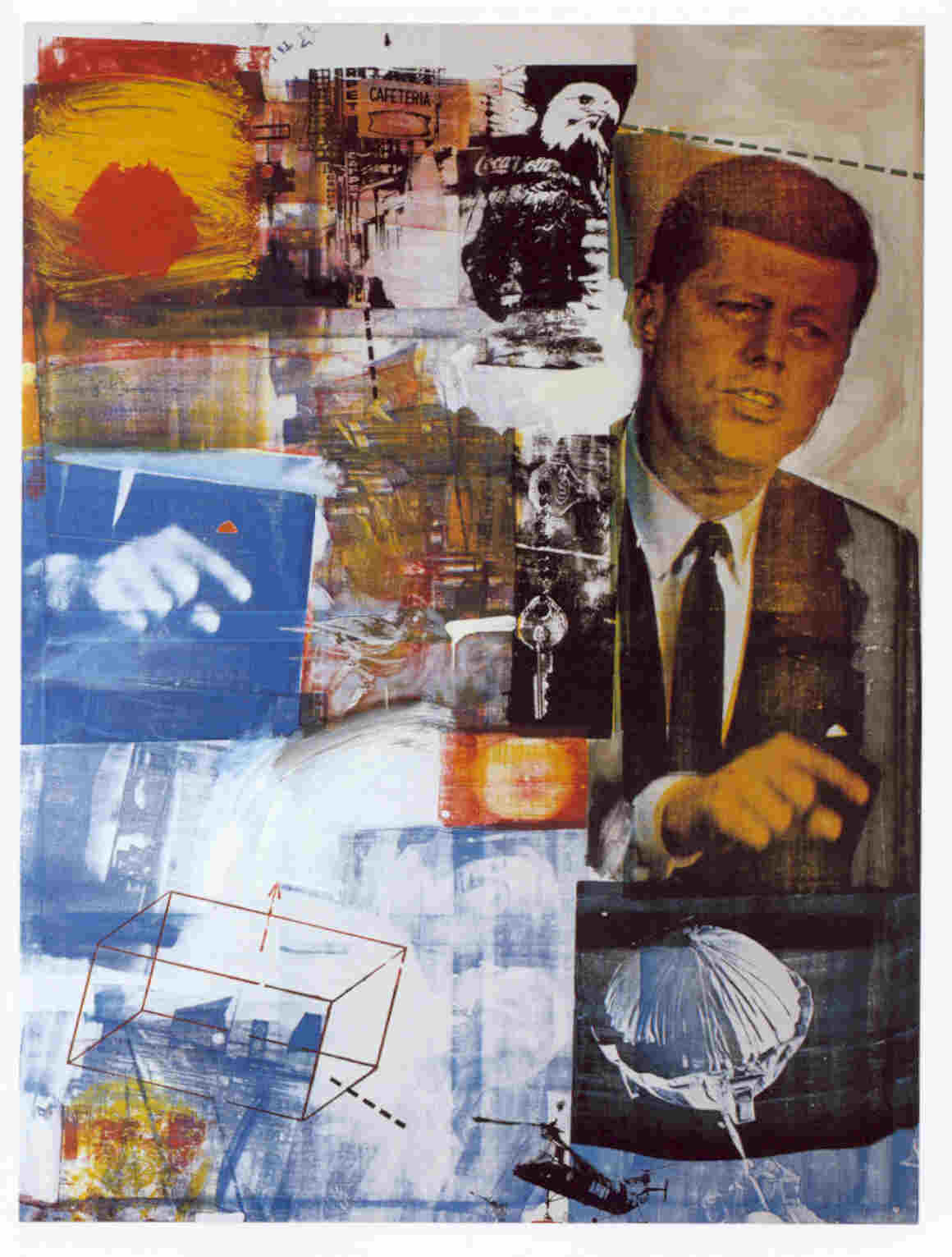
 In my designs, I decided that I would be producing three A3 sized canvases and one A4 sized canvas that would all be suspended using metal wire and hooks. I have intended on using metal wire throughout the whole piece, so it seemed suitable for holding the pieces in the air as well. When I visited the IKON gallery to view, Roger Hirons’s exhibition, I found the ‘untitled 2014’ piece inspiring. I found the hanging of objects from the ceiling within his piece appealing. The composition created through hanging the objects was interesting and led me to in cooperating it within my final outcome design as made evident within these images.
Afterwards, I began applying the composition I had planned on producing, which consisted of photography folded and bent in a manner that created an illusion of three-dimensionality. Through my experiment’s I the planned on creating the once 2D monochrome photography of structures located around my home town (Nuneaton), Birmingham and Coventry into forms that had a three-dimensional quality. The bending of the photography was inspired by the artist, ‘Lucas Simoes’ with his continuous collage pieces, that involved the bending of architectural photography to form water-droplet shapes in a continuous nature. This challenging of the ordinary, through transforming a typically flat medium into a possessing a 3D quality, was further developed through my preparation work. I interpreted the idea as linking to my concept of ‘Stereoblindness’ through the fact that the eye has to focus on shadows and movement of the buildings in order to pick up that it’s three-dimensional. Furthermore, the buildings are folded and bent in a way that challenges the ordinary, due to having overly exaggerated curves and perspectives that wouldn’t be found within the real world.

 |
| Add caption |

From the start of this final outcome, I intended on applying colour through the use of abandoned everyday objects, such as Coke Cola and Pepsi cans for the recognisable red and blue colours present within the logos and packaging. I intended on only having these colours present within my final piece, because of the recognisable link to 3D glasses and photography. From past experiences of not being able to view 3D films, due to my vision impairment I felt the requirement to present this in the form of objects that have been impacted by damage. To represent my feeling of anger towards never being capable of enjoying these little things, most people take for granted. On looking back on this piece, the objects didn’t emphasise these two colours as much as I planned on. So, I could have improved this outcome through editing a few of the photographs to have a washed blue and red coating, similar to what I have already used within my preparation experiments.

 |
| Roger Hiorn’s Untitled 2014 |

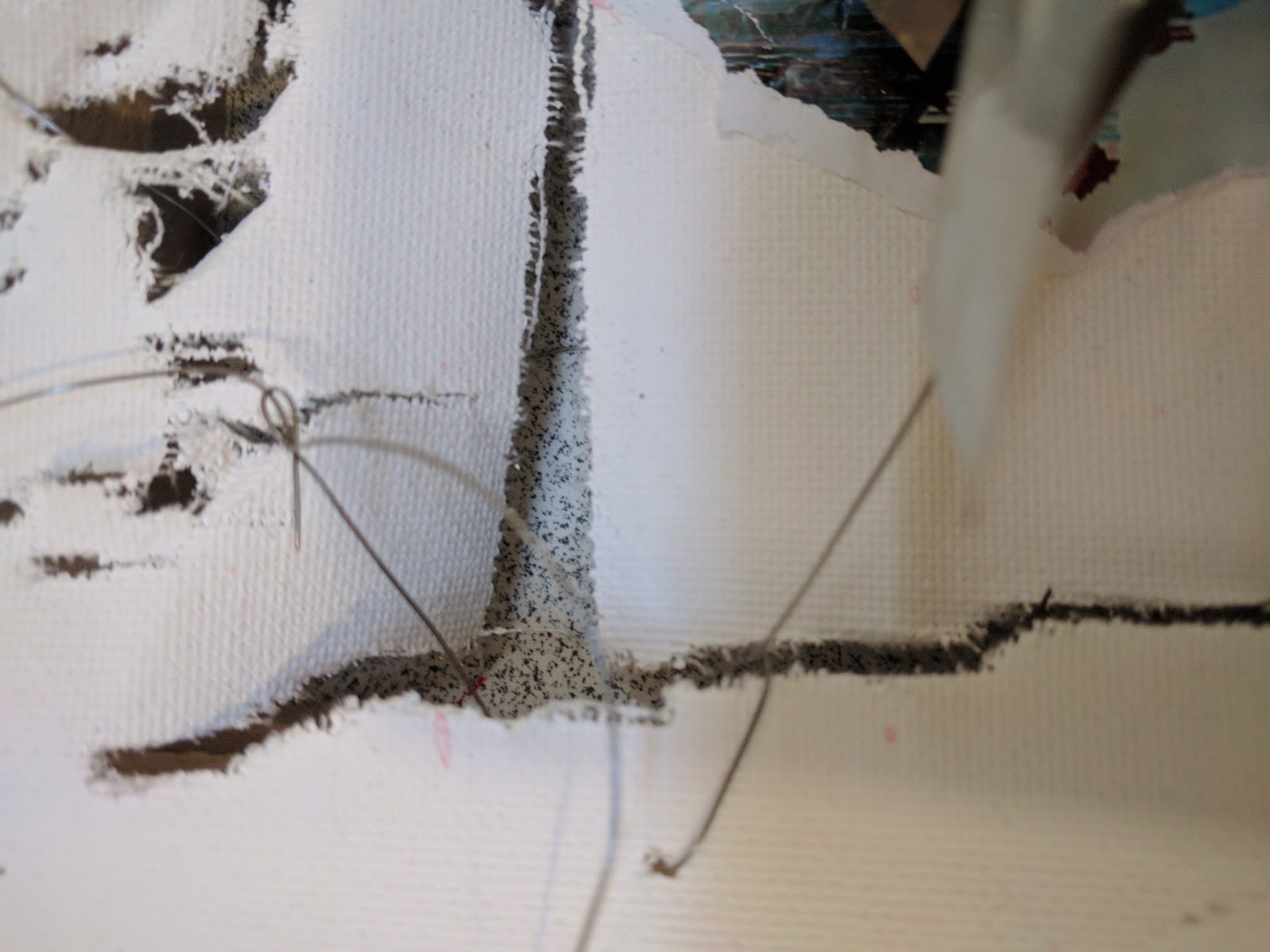
From my preparation work, I had come to the conclusion that using a sewing needle to pierce the both the canvas and photography twice, so that the metal wire could be pushed through both, in order to fix them together. I used metal wire instead of typically used PVA because the force of the bending created a large amount of force that couldn’t be held in place using PVA. After pushing the wire through both holes, I tied the wire. This method is similar to how products are typically held in the packaging of toys.


Around each canvas, acetate was applied to break up the monochrome photography and create more diversity within the composition. The acetate reminded me of the transparent film used within 3D glasses, however, due to my decision on creating focus through colour on the small combine pieces made up of cans I determined that black and white acetate would be most relevant. However, on looking back on the final outcome I could have improved it with printing onto coloured transparent acetate and then applying it to the outcome.
The collection of acetate was made up of photography focused on nature and close-ups of details found within the urban area, such as pebbles, leaves, the green man on traffic lights and flowers. I further made the link to my vision through the use of photos of my eyes on the acetate. The transparent qualities of the acetate, supported the perspective illusion through the layering effect and bending of it.


 |
| Lucio Fontana’s example |
 |
| No Lighting used |
 |
| Lighting used |
After finishing my final outcome, I decided that the lighting is important to make visible my concept of needing to focus more on shadows so that I can pick out the 3D nature of the world. The lamp further aided in emphasising the shiny metal, the presence of the piece.


