Friday, 21 April 2017

Ink Bleeding

I decided from being inspired by my 3D work, to experiment with creating distorted drawings with the Ink bleeding technique and the use of my photography that I took around Birmingham. I had hoped that this would create a different view that challenged typical ways to view the world. I don't find my vision a negative impact, because I find that its changed the way I see the world, hence making me who I am today. 


I had started with the intention of combining both the typical blue and red together to produce the ink bleeding technique. However, I felt the need to find out what black produced on its own, to produce a drawing of my photo that was a lift that stretched into the sky. 


I began the experiment, with first drawing out the structure with little detail as possible, because I though that more detail once the hair spray was applied would make the drawing hard to make out. After finishing the drawing I applied hair spray and held it upwards, so that the ink dripped downwards. The result of this made the lines faint and the once black colour turned into a light-shaded purple. Furthermore, I found that the hairspray strained the paper, creating a light yellow colour in parts that wasn't covered by the ink 

With the second drawing, I tried producing thicker lines because I knew this time that they become fainter. Furthermore, I applied less hairspray as the previous one was too diluted. The end result showed me that the thicker lines and less hairspray created darker patches of ink bleeding. 

On the back, another piece was produced. (on right) This reminded myself of the time I had to wear glasses, With the glasses, the vision was stronger and without the vision was weaker. I haven't had to wear glasses for years, because my eye sight improved over time. 


Front

I decided that I had experimented enough with just black biro, so started experimenting with applying blue biro with the black. 

Back
I was inspired by Robert Rauschenberg's expressive abstract parts of his work created through quick application of paint. I decided to apply ink in a quick manner using my left hand which isn't my strongest, to produce a semi- expressive abstract drawing based on the pattern on the outside of the Birmingham Library. I feel that the drawing without the hair-spray wasn't that abstract. However, once it was applied the drawing transformed. 


The blue biro didn't seem to bleed as well as the black, which could be due to the different makes of pen, hence different ink used. 


Front
Back


The previous drawing didn't show much structure and resemblance to part of a building, so I decided to produce another blue and black biro drawing based more on the structural qualities. I felt that I had improved in controlling the ink bleeding, when I looked back at the first drawing. The ink seemed contained within the outline. 


Front


The hair spray made the paper weak and I felt with applying an additional ink, then more hairspray would be needed, especially with the small scale. I came to the conclusion that applying newspaper, would thicken the base, therefore more resistant to the hairspray. Furthermore, I had believed that the once white plain areas, would be improved by being replaced by text from the newspaper. 

Within this drawing I met my aim of reaching red and blue, the typical 3D effect colours that have been used since the creation. The black was used to produce the outline of the building and the red and blue was used to add tone and shade. Hence, my drawing had become more detailed over the period of this ink bleeding experiment. This is made evident when this example is compared to the first example of ink bleeding. 


Back
 The red biro also seemed to struggle bleeding. However, the slight bleed of the red and blue, merged with the strong black creating a unique combination when forced to drip downwards. 


The result of this drawing made clear that the newspaper didn't make the piece as successful as previous pieces, I believe the negative space aided the drawings massively. On the back, its made evident that the ink didn't bleed through. However, on second thought I found the back drawings interesting. 


Front

I further experimented with the ink bleeding, by applying another colour. I decided on green, because it wasn't similar to the other colours I had already experimented and already decided to use. 


Back
After producing this piece, I have came to the conclusion that I find the back-wards, opposite nature of the drawings interesting. From this piece, the back drawing has the structure mirrored. However the ink bleeding is slightly different, its more distorted and weak. Hence, could be interpreted as being my vision. Mine being the "back" and others being the "front". 


Front


Back


I used this effect of ink being transferred onto the other side to further experiment with the bleeding effect. I produced a drawing on either side of the page, one being of a unusual telephone box and the other being a window from a building. Once I had completed both, I applied hairspray.  


I found these ink bleeding drawings, appeared similar to the Korean artist, known as Sunga Park. She creates her work with the intention of unpredictability because of the watercolours nature. She allows her paintings to fade away into a wash. 
She travels around Europe, finding a interest in mostly Gothic cathedrals and rooftops. I have come across Paths work before, so I'm assuming I was inspired by her. 


Thursday, 20 April 2017

Photography and observations from visit around Birmingham

After and in between visiting the Birmingham art galleries, I took photography and observations because I had the intentions of using them within my work, to help me understand the best places to use for creating into a different perspective. I wanted places that would be recognisable because the viewer would then be able to make out hints of the place through memory. 


I found this photograph interesting, because of the high camera angle that captures the structure in a unique manner. The blue tinted glass almost dissolves into the sky as the structure increases in height. I don't believe this photograph would have been as strong if it was taken in monochrome. The colour combination works well. 

This building itself is unusual because the lift is basically hanging off the side of the building. 


This long shot, made more of the building visible, however, doesn't seem as strong as the previous photograph, that emphasised a part of the structure e.g the lift. 


I later, re-took the photograph with more emphasis on the middle area that had columns present. I prefer this one because it captures the uniqueness of the building which the walls on either side of it, seem not to possess. 


I found this pattern on the side of the Birmingham Library, the complex circular pattern is unique to this building, making it more recognisable. The Library at its time challenged the ordinary, because of the unusual architecture. 
I wanted to further visualise this pattern from different points of view, so I travelled to one of the roofs. I was able to take this photograph, with the caution of the danger. However, this photo showed signs of continuous lines that fade to one point. I found this most successful.  
When travelling down to ground floor, I saw this shot through a window. The pattern framed around a building perfectly, further highlighting the structure from afar. 
This photography was taken from the top floor of the Birmingham Library. The natural lighting from the sun created a perfect shadow behind the skyscraper. It creates a perfect cut. 

I surprisingly found Braille on a sign, which is an uncommon quality found in public areas. It opened my eyes to changing times, that now structures are supporting more people with disabilities, such as blindness. 
I found the ceiling for this structure, interesting because of its complex support system and pathways stretching across.  

Wednesday, 19 April 2017

3D Photography

All these photographs were taken around my hometown, because its the most common surroundings I experience. After producing the first photograph with the 3D effect on it, I decided to produce more, to further develop on the idea. I had noticed that the 3D effect is used little within art, however, its main user is the film industry, especially Hollywood producers. The 3D effect presents my vision in an unique manner, because it captures the lack of depth perspective, due to multiple images of the same object and subject. 

These photos challenge the way people view the world, they present the world in a different manner, from the overly colourful to the bizarre and crazy. I want people to understand the struggles of being unable to locate objects and subjects. To always question if its really that close or really that far. 

The process of creating each photograph is present within my sketchbook, with annotations. 


This was the first photograph that I decided to turn into a 3D image. The two usual cyan and red colours were used to create the effect. I decided not to experiment with changing the placement, so the two different coloured photos reminded to be 10 spaces away from each other.


I later developed the previous piece, by changing the colour selection to red and dark blue. When these colours combined, they seemed to have turned the majority of the photo purple, which is expected with the use of the colour wheel.

Within my sketchbook, I decided to turn the photograph upside down, to further distort the image and challenge the ordinary.


This photograph is of a telephone line, I chose this high angle camera shot, because of the lines that meet into the centre, I thought this would benefit the 3D effect. I believe that it was successful. However, it doesn't support the lack of depth perspective as strong as other, due to little context. 


This photograph was produced differently, with the intention of creating movement. This was achieved through multiple images being overlapped and set to become transparent. I find the most hardest thing to see are moving objects, this led to myself almost being unable to drive a car because of this vision impairment. 


I developed on the previous piece by applying colour to the photograph, this seemed to make it more distorted. 


I tired producing a similar one to the previous piece, however, I decided to have the car from the side instead of from the front. This seemed to emphasis movement more. Yet, more by the fact that the spacing between the photos had been increased. 


I wanted to make a really over exaggerated photograph that made pin pointing the location of the car impossible. The different colour further support this, by making distinct layers and overlaps. 


I decided that a person riding a bike, would be suitable to this effect as it is a another example of a moving object. I struggled for most of my life to ride a bike, however, its only recently I've worked my way around a lack of balance in order for myself to ride on. I believe this was further supported by myself learning to drive a car. 


This is a long camera shot. The detail seems to be far less making the different coloured photos seem more separated, than more detailed photos.


I found complex city areas, made the 3D effect turn more into a distorted mess of confusion. However, this might also be due to the colours selected. 


I experimented with living beings as well as objects, to further understand the 3D effect. However, I will never be able to truly see the 3D effect work. 


I wanted to try creating the 3D effect without the need of Photoshop, so I decided that printing a different coloured photograph onto acetate and then overlaying it, could be a good equivalent. The acetate seems to be successful in creating the 3D effect, however, the details of the photos are lost through the printing process, because the acetate can't produce the same amount of detail as photo paper does. 


3D Effect (Photoshop Process)

From my research into the condition 'stereo blindness', I was inspired to use my weakness which is being unable to view the world in 3D and having a lack of depth perception, into my work. From looking into 3D images, I found that they create a distorted effect of depth, due to two images overlaying each other, but with minor separation. I wanted to further evaluate this, by creating my own 3D images. This allowed me to further understand my condition, how the 3D images work and why they don't work for me. 

https://www.youtube.com/watch?v=3GsCU4wHdmg

I found this tutorial and started creating my own photography that captured the world into 3D images. I feel that this brought to attention the world from a different perspective, my perspective. 


My process with inspiration from existing method. 
I began by opening the image into Adobe Photoshop. I had taken the image in monochrome, using a Canon Camera. I felt that this image would be ideal for this experiment because it’s a recognisable and common word to be found, “Slow”.


I started by creating a copy of the layer, 
which was achieved by clicking onto the 
layer and then pressing down at the 
same time, ctrl + J. 


I then right clicked on to one of the layers “layer 1”, and then at the top clicked onto “blending options”. 


After that has been achieved this tab, titled “layer style” should appear. 

Next I went to the “Advanced Blending” options. I wanted the first layer to be red, so I achieved that by un-selecting “G” standing for green and “B” standing for blue.

The red layer being achieved was made visible by the example square.


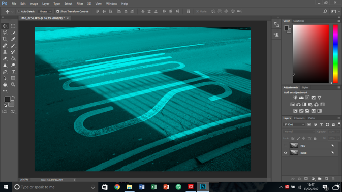
This action created a red layer like shown. To see this I un-selected the viability icon on the other un-changed layer. 

I renamed the layer “RED” for future purposes. 


I repeated the previous sets, however, I wanted this layer to be cyan. This was achieved by instead of un-selecting green and blue, I un-selected “R” = red.  


I now have two layers, one being red and the other being cyan. I intended on creating these colours because they are the most commonly used colours for creating 3D. 

I renamed the layer “BLUE” for future purposes. 


When both layers are made visible they appear like this, because the two separate, different coloured layers merge together. 


To begin creating the 3D effect, I clicked on the “RED” layer. I started moving it to the left by holding down ctrl and then pressing the left key, about 6 times to achieve this example. I repeated these steps for the “Blue”, however, I moved it to the right, using the right key.  


I wanted it to seem more distorted, so I continued to move the two layers apart.